Content
- Definition of the Website Interface
- Importance of the Website Interface
- Main Elements of the Website Interface
- Creating a Quality Interface
- Common Mistakes and How to Avoid Them
Definition of the Website Interface
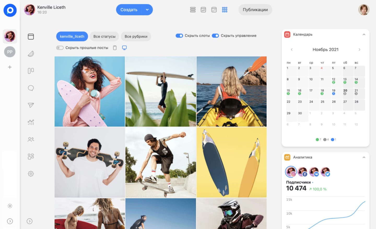
The website interface is a set of elements that allow the user to interact with the web resource. It includes various visual elements such as images, fonts, and color schemes, as well as text blocks, including headings and paragraphs. Additionally, navigation and control tools play an important role, providing the ability to move between sections, add items to a cart, and perform other actions. Simply put, the interface is what the user sees on the screen after accessing the website or application. A well-thought-out interface directly impacts the success of the project, as user-friendliness contributes to increased user satisfaction, higher traffic, and improved conversion rates.
Importance of the Website Interface
The interface serves as a kind of "bridge" between the user and the website. The web resource is a complex technical system, but the user does not need to delve into details such as code or algorithms; it is essential for them to achieve a result, such as reading interesting text or making a purchase. The interface enables the user to issue commands, which the system processes and responds accordingly. Key functions of the interface include:
- Information Display: Allows the user to view content in a convenient form.
- Navigation: Interface elements help the user move around the website.
- Data Processing: The interface responds to user actions and processes the input data.
- Business Interaction with the User: Provides mechanisms for communication between clients and the company.
These functions make the interface an important tool in the modern world, influencing user satisfaction, loyalty, and ultimately, the company’s profit.
Main Elements of the Website Interface
The website interface includes all visual elements that the user sees when visiting the web resource. Let's examine the most important of them that affect usability, conversions, and sales:
- Content Elements: Include text, images, videos, and other blocks that inform the user.
- Navigation Elements: Menus, links, and search bars that simplify information retrieval.
- Action Elements: Buttons, forms, and other components that allow the user to perform actions such as purchases or registrations.
- Forms: Used to collect information from users, for example, when subscribing to newsletters.
- Branding Elements: Logo and corporate colors that help identify the company.
- Header: The top part of the website where navigation and branding elements are placed.
- Footer: The bottom part of the website with contact information and links to important sections.
Creating a Quality Interface
When developing an interface, it is important to consider the page structure and the functionality of the elements. Below are key criteria that a quality interface should meet:
- Simplicity and Intuitiveness: The interface should be understandable so that users can easily navigate.
- Consistency of Style and Design: All elements should adhere to a unified style for better perception.
- Availability of Hints: It is necessary to implement mechanisms that allow the user to get assistance.
- Speed: The website's loading time should be minimal to retain users.
- Responsiveness: The interface should display correctly on all devices.
- Accessibility: The website should be accessible to all users, including those with disabilities.
Testing the interface with real users at all stages of development helps identify potential problems and improve the user experience.
Common Mistakes and How to Avoid Them
When creating interfaces, designers and developers can make mistakes that negatively affect the user experience. Let's look at common mistakes and ways to prevent them:
- Information Overload: Too many elements can distract the user. It is important to monitor the number of elements and their placement.
- Complex Navigation: Avoid unconventional solutions. It is better to use familiar navigation schemes.
- Using Unconventional Icons: Icons should be intuitive; otherwise, users may become confused.
- Too Long Forms: Forms should be simple, containing only necessary fields for completion.
- Intrusive Pop-ups: The number of pop-ups should be minimized, and close buttons should be noticeable.
By avoiding these common mistakes, it is possible to create a more user-friendly and effective interface that facilitates successful user interaction with the website.

