In 2026, typography remains one of the main tools that helps to stand out a post in the feed and convey the brand's mood in seconds. The right font makes the text memorable, enhances emotional impact, and increases audience engagement. This is especially important for SMM projects, where every visual element works towards conversion.
Today, we will discuss the current trends in beautiful fonts, show where to download them for free with Cyrillic support, and provide practical recommendations for their use in publication design. This material will help you quickly find a suitable option for your project and create a harmonious text accent.
Trends in Beautiful Fonts for 2026
In the coming year, designers are increasingly choosing a combination of minimalism and expressiveness. Geometric shapes with soft curves are popular, looking modern on mobile screens. Elegant serif fonts reminiscent of classic printing but adapted for digital formats remain relevant.
Special attention is given to Cyrillic text: fonts with high-quality rendering of Russian letters help avoid "crooked" display and maintain style. An original and interesting approach is also relevant—slight angularity or experiments with line thickness contrast.
Where to Download Free Fonts with Cyrillic Support
Many quality options are available on specialized platforms. Here are some trusted resources where you can download files without registration:
-
Google Fonts — a vast catalog with filters by language, including a complete Cyrillic set. All fonts are free — commercial use without restrictions.
-
Fonts-online.ru — a convenient category of beautiful fonts with examples of Cyrillic.
-
Websites like Fontesk and 1001Fonts — style filters and availability of free licenses.
Before downloading, always check the license: many fonts are permitted for personal projects and commercial use, but sometimes attribution to the author is required.
If you need to quickly test a font online, use text generators — they show how the text will look in different sizes and colors.
How to Choose a Font for a Specific Project
Before uploading a font, it's important to consider the specific tasks and platforms for content placement. For Instagram* and VK, expressive options that are easily readable even in small sizes are suitable. For long text in posts, it's better to stick with neutral grotesques with good readability.

Recommendation: start by analyzing the brand's mood. If the project is strict and professional, choose classics. For youth content, a more dynamic and original option will work.
It’s important to check how the font displays on different devices. Test the contrast between text and background to ensure the text remains readable at any screen brightness.
Examples of Popular Fonts and Their Application
Let's look at a few relevant options for 2026.
-
One interesting font to download is the unconventional raydis font. It is angular and has a modern square geometry, making it suitable for headlines in tech projects.
-
A classic example is playfair (or playfairdisplay). This exquisite serif font looks perfect in elegant inscriptions for premium brands and stories.
-
For everyday publications, a universal grotesque works well, looking good at any size and not straining the eyes.
Usage: in an advertising post, the title is set in a bold display font, while the main text uses a calmer font. This achieves hierarchy and draws immediate attention to the main word.
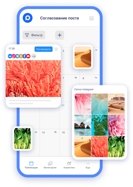
Once you have selected the suitable font and prepared the layout, it’s important to quickly transfer it to the publication and approve it with the team or client. This is where Postmypost helps — it combines content creation, team approval, and autoposting in one convenient interface. You just need to write the post yourself or with the help of the built-in AI assistant, upload the finished design with the required font, and immediately publish it across several social networks. This accelerates the process from idea to post release several times, and the font accents look equally best across all platforms.
Recommendations for Using Fonts in Social Media Design
To ensure the font works effectively, follow a few rules.
-
First, do not use more than two or three fonts in one layout. One for the title, a second for the main text, and a third (if necessary) for accents.
-
Second, consider readability: the minimum text size in posts is 14–16 pt, and larger for stories. Add padding and alignment to ensure the text block looks neat.
-
Third, experiment with color and effects, but moderately. A gradient or slight shadow can enhance the text accent, especially if the font has decorative elements.
For team collaboration, it’s convenient when all participants can see the final look of the publication with the selected fonts at the approval stage. This helps avoid edits after publication and saves time.
If you often work with visual content, it would be beneficial to read our article on what identity is and how it helps in positioning. There, we discuss in detail how fonts fit into the overall brand style.
Another recommendation is the material “Main tools for SMM specialists.” It explains how to quickly create posts with ready-made templates and edit text right in a convenient interface.
Conclusion: How Fonts Help in Promotion
Beautiful typography is not just decor but a tool that enhances content perception and trust in the brand. In 2026, those who work intelligently with fonts gain more engagement and stand out better in the competitive feed.
Start with a small selection of 5-7 options, test them in real posts, and monitor audience reactions. Over time, you will form your own collection that perfectly fits your style.
If this material was helpful, save it to your bookmarks and return when you need to refresh your ideas for the next project. Happy publishing and bright inscriptions!