Without statistics, it's hard to understand if the content and community promotion are effective. Fortunately, VKontakte provides detailed metrics. This is a plus: there's no need to guess. The main thing is to figure out which metrics to focus on. This article explains how to quickly gather VK statistics.
Where to find VK group statistics
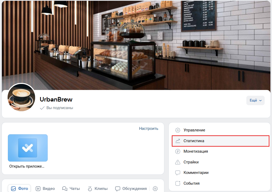
Analytics is available to community administrators — just click on "Statistics" in the side menu.
A dashboard will open — this is the starting point. Key metrics are immediately visible: reach, views, likes, shares, comments, new subscribers, and clicks on the action button.
At the same time, you can choose the period: today, yesterday, week, month, or any other interval via the calendar. This is convenient when you need to compile a VK report, for example, for the quarter.
What sections are available
The updated analytics provides many categories for community reports — detailed data on different types of content.
Section "Community"
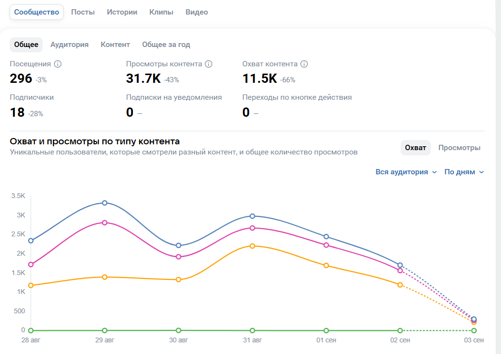
This is the main block of statistics. Here you can immediately see how the metrics have changed — views, subscriptions, messages.
The data is displayed dynamically. For example, if reach increased by 15% over a week but comments decreased by 10%, it’s a reason to ponder. Yes, the audience is coming in, but engagement is dropping.
In the "Community" section, you can see reach, views, likes, comments, subscriptions and unsubscriptions, shares, clicks on the action button, and even subscriptions to notifications. Everything is conveniently presented in graphs.
There’s also a tab "Audience" — you can see where people are coming from: recommendations, search, ads, or directly.
Section "Posts"
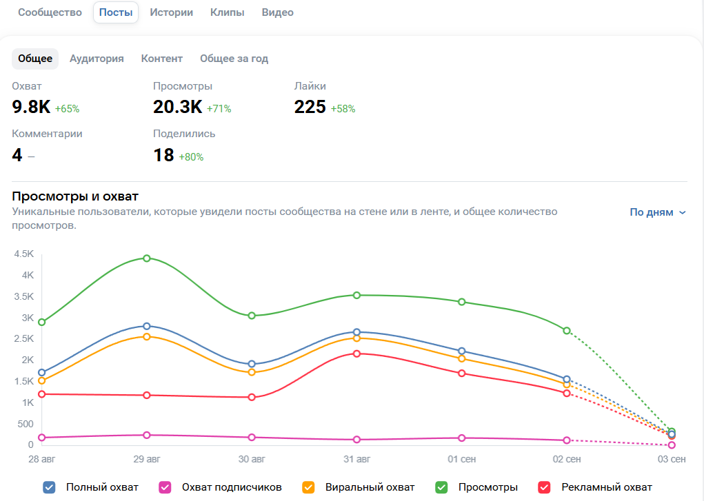
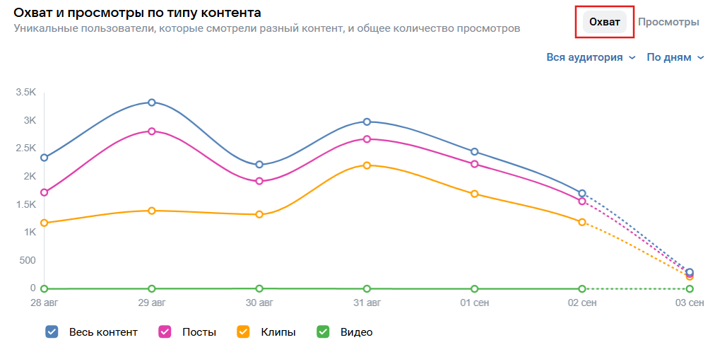
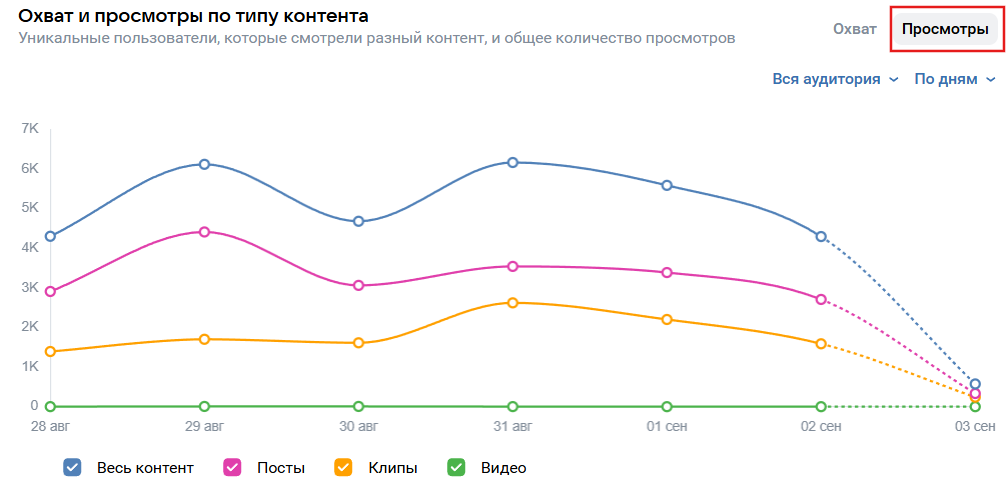
This section answers the main question: what exactly do people like. Here you can compare which type of posts gets more views and reactions — posts, photos, videos, clips, or products.
The statistics for each individual entry are especially useful. It’s easy to study a specific post: how many people saw it, how many liked it, how many shared it. This helps identify patterns. Maybe Monday polls get more reach than Friday memes, or vice versa.
Section "Stories"
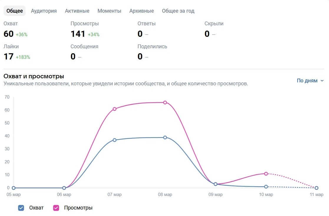

Stories also have statistics. You can see how many times they were viewed, how many people replied, shared, or hid them. The last metric is especially important: if many people hide stories, it means they are either too intrusive or not aligning with the audience's interests.
There is a separate section "Moments" — these are collections of stories. Essentially, it's like everlasting stories, but with its own analytics: you can see how well the audience responds to a specific collection.
Clips and Videos

These tabs share the same logic. The summary of views and reactions is shown at the top, with detailed statistics below: who is watching, on which devices and platforms, which videos lead in engagement.
This is very useful for experimenting with formats. It may turn out that clips gain reach but do not engage much, while long videos, conversely, generate more comments and discussions. Then strategies can be adjusted: some content can be made for reach, and some for engagement.
Which metrics to focus on
To compile a VK community report, it’s useful to focus on several indicators.
Unique Visitors
This is the number of different people who visited the community during the selected period. The same person counts only once in the statistics. This data shows real interest in your platform.
The main question here is: do visits convert into subscriptions? If many people visit but the audience doesn’t grow, something is wrong with the first screen — the cover, description, pinned post, or action button.
The conversion to subscription is calculated simply: divide new subscribers by the number of unique visitors and multiply by 100%. If it’s less than 1-2%, it’s worth considering how the audience perceives you.
Views
This metric shows how many times the community page was opened. One person can give multiple views. Here, the number itself isn’t as important as the depth: divide views by unique visitors and see how immersed the audience is in the content. If the ratio is less than 1.3, it means people are coming and leaving immediately. A normal level is around 1.5-2. If it’s higher, that’s a good sign: people are interested, scrolling through, exploring, and staying.
To increase depth, it’s important for the community to have a logical showcase: a pinned post, a convenient menu, collections of materials. Then a person won’t just take a quick glance but will scroll through.
Gender and Age
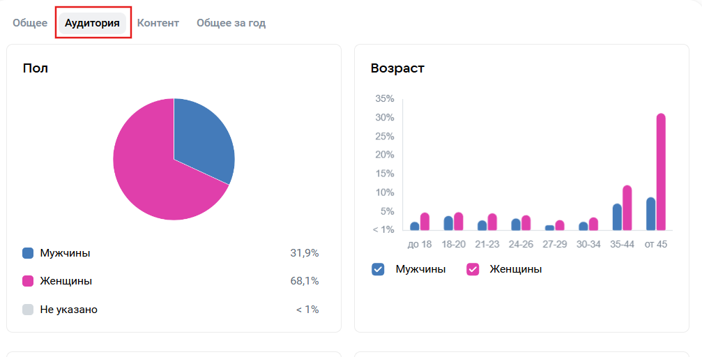
The "Audience" tab contains detailed demographics. This data helps understand if the actual audience matches the expected one. For example, if you sell cosmetics, but the statistics show a skew towards men aged 35+, something is amiss: either the advertising is misconfigured, or the content itself attracts a different type of audience.
It’s worth comparing not only the composition of visitors but also those who actually subscribe. Young people may glance but not stay. In this case, it’s advisable to change the presentation format: post more short videos, interactive content, and use a lively language.
Geography
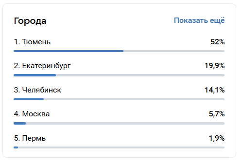
Below in the "Audience" section is the breakdown by cities. This statistic helps understand where the core audience lives.
Sometimes it’s surprising to find that a significant portion of traffic comes not from Moscow, but from, for instance, Yekaterinburg or Krasnoyarsk. This is a reason to consider local campaigns: participating in city events, targeting specific regions. You might even adjust posting times — align with time zones.
Devices
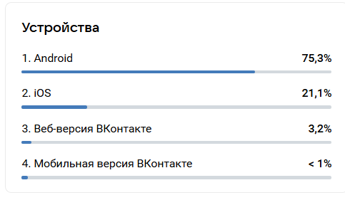
The list of devices is located next to the cities. It’s simple: what gadgets the visitors are using.
The difference between desktop and mobile users sometimes affects conversions. If 80% of people access from phones, but the application form is long and inconvenient, you’re losing a significant portion of leads. For mobile audiences, short texts, vertical videos, and one-tap buttons are necessary. If desktop users dominate, you can afford long reads and PDF files.
Subscribers and Dynamics
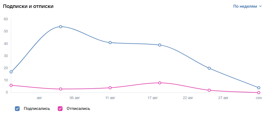
This is the most important block, located in the "General" section of "Community." The graphs show the dynamics of subscriptions, unsubscriptions, and net gains. Here it’s useful to look not only at the numbers but also at what they are related to. A sharp increase? Most likely, there was advertising or a viral post. A spike in unsubscriptions? Perhaps too many sales pitches or an unsuccessful mailing.
Important: About Metrics
It’s not wise to consider each number separately — it’s more important how they are interconnected. For example, if unique visitors are increasing but subscriptions aren’t — the problem lies in the first screen. Traffic is stable, and views per person are increasing? This means the audience is engaging, and you need to expand your reach. Another case is a large mobile share but low conversions. The solution: simplify the path for smartphones.
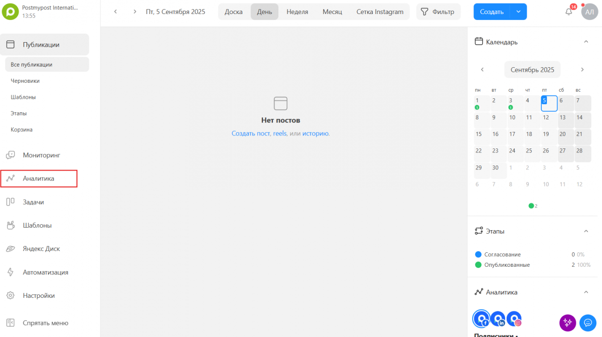
How to automate data collection
Analyzing data from VKontakte manually is possible, but it takes time. This is where our Postmypost analytics and automation service comes in handy.
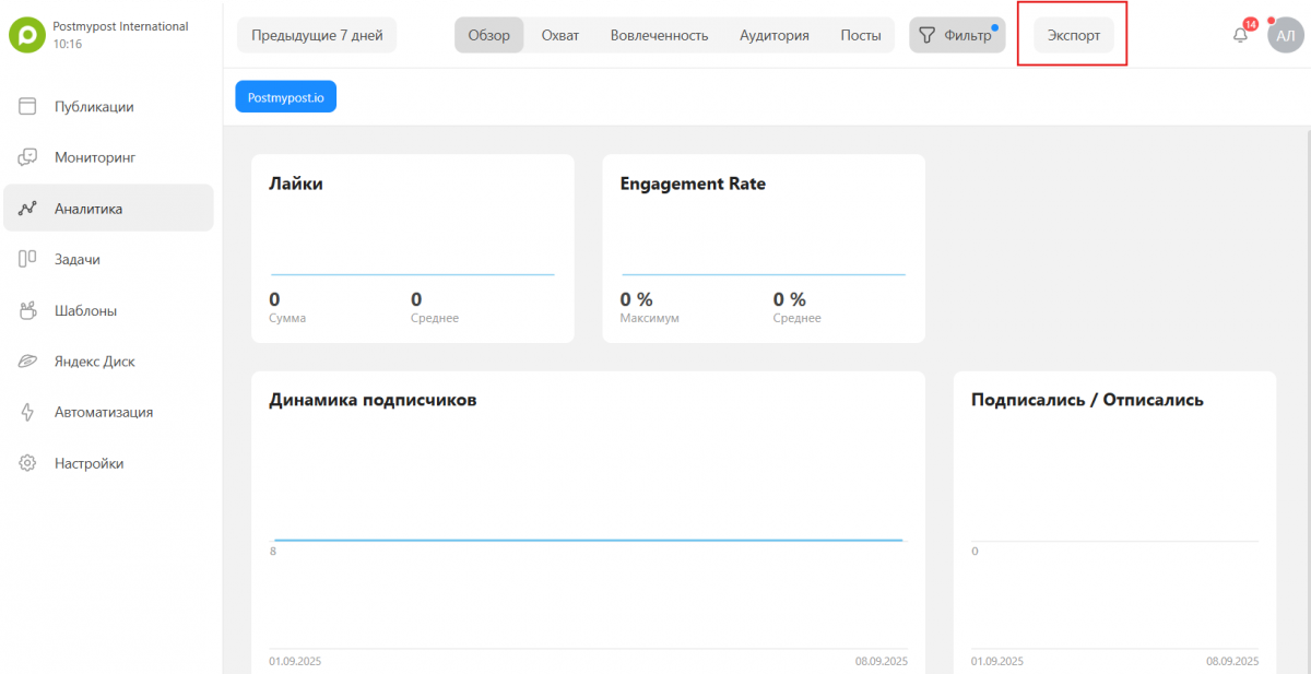
To get a report, open the "Analytics" section.
 Click "Export".
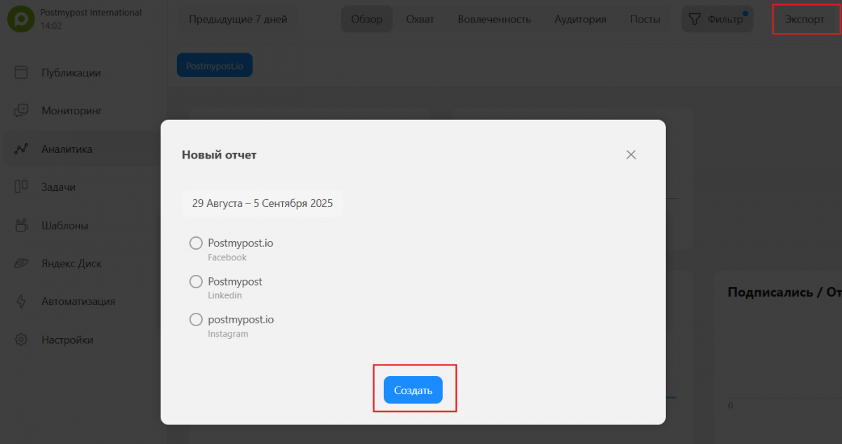
 Choose the social network and click "Create".
 Final advice: sometimes a graph appears flat, but in reality, there are fluctuations in the hundreds. Therefore, it's important to look closely at the numbers. And always compare similar periods: week with week, month with month. Otherwise, it’s easy to mistake a seasonal decline for a disaster.